Why page two of your AI-built site looks wrong.
One page from an agent can look great. Ask for the next page in a new chat and the details stop agreeing: another typeface, another accent colour, even another customer. Five moves make page two agree with page one: one type pairing, a short list of text sizes, two corner radii, one way to lift things, and one accent with one sentence about who the product is for. Then write those decisions down, so the next chat starts from them.
Two chats, two companies
I tested it on a made-up expense tracker called Tallybird. A fresh incognito chat, no rules, one line: build me a landing page for an expense tracker called Tallybird.
And honestly, it was good. A clear headline and a little demo you can actually type into. I'd ship it.
Then I opened a new chat and asked for the pricing page. It came back in a different typeface. The yellow was now navy. The logo had changed. And it had decided Tallybird sells to finance teams, at $72 a month, while the landing page promises $3.
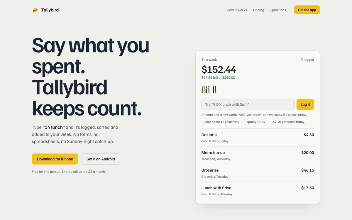
 Landing page, first chat
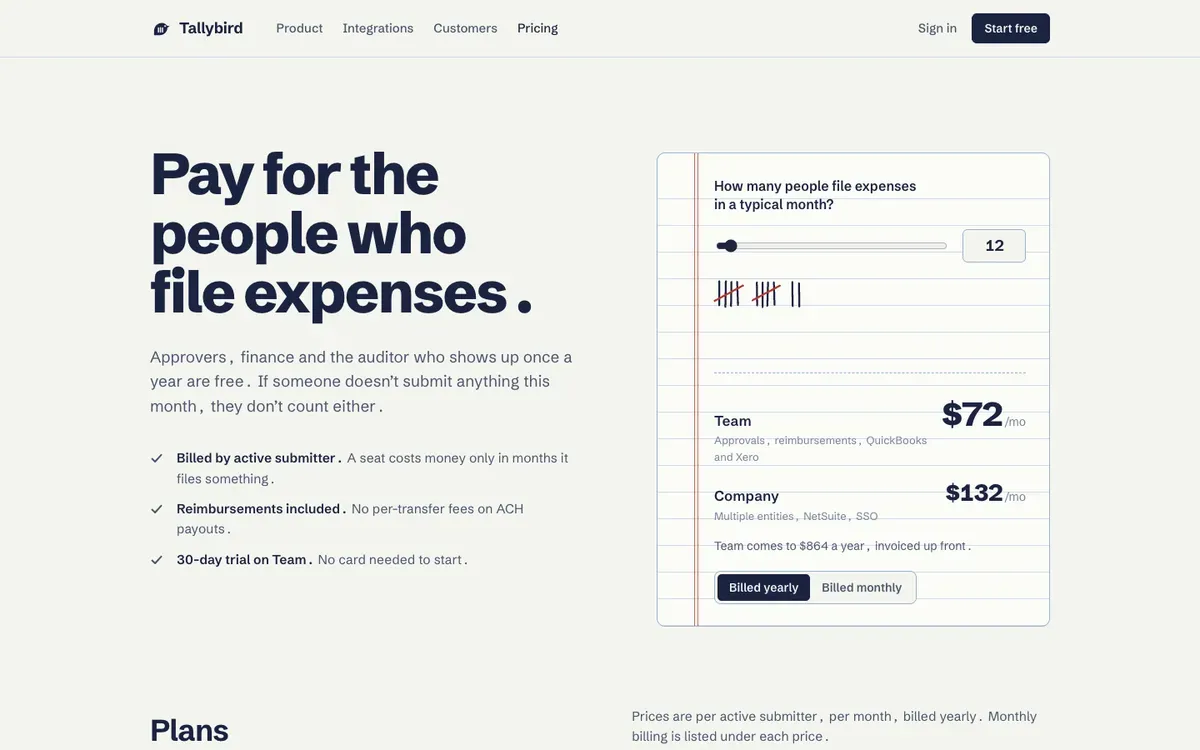
 Pricing page, second chat
Two pages, two companies. For me, that's the whole story of AI slop. One page from Claude can look great. Slop is what happens on page two, when the details stop agreeing with each other.
Five moves to make page two agree
1. Type
The landing page is set in Familjen Grotesk, the pricing page in Schibsted Grotesk. Two lovely fonts that have never met. Pick one pair and write it down.
2. Sizes
The landing page alone uses 18 different text sizes. Nobody can feel a system with 18 steps. Six or seven is plenty.
3. Corners
Page one rounds things at 10, 16 and 7 pixels, plus a few kinds of fully round. Page two uses 5, 6, 8 and 10. Choose two numbers and stick to them.
4. Depth
The landing page puts a shadow under its card, and the pricing page has none at all. Choose one way to lift things. I'm lazy, so I'd delete the shadow and use a one pixel border everywhere.
5. The accent and the story
One accent colour, used only for actions. And one sentence about who the product is for, so the next page doesn't invent a new customer.
Before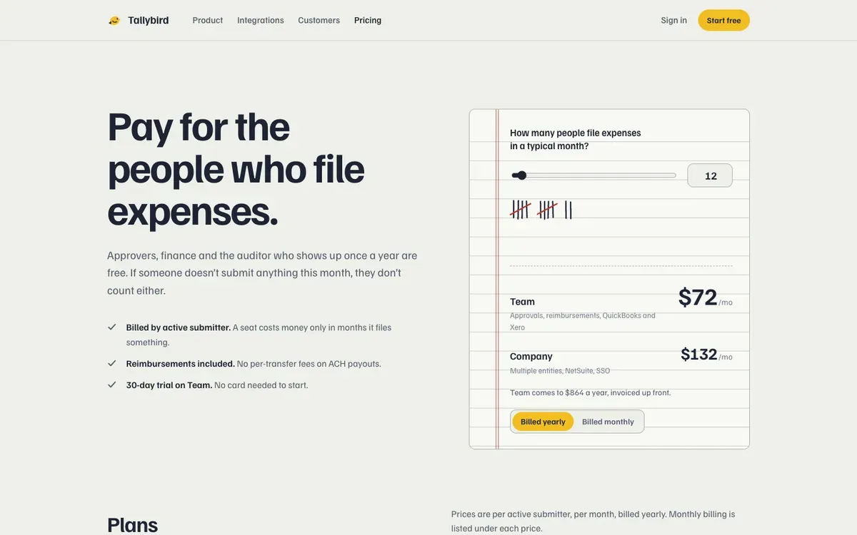
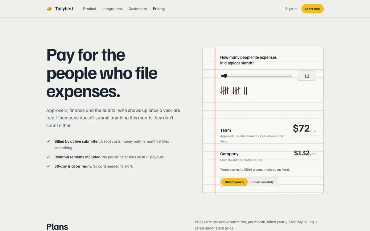 After
Write the decisions down
In this test, I didn't give the second chat page one's decisions. It had the product name, but not the type, the colours or the description of the customer I'd already ended up with. So it made those choices again.
I'd write the choices down in the project's instructions. If you're using Claude Code, put them in CLAUDE.md:
- The type pairing.
- The six or seven text sizes.
- The two corner radii.
- One way to lift things, such as a one pixel border.
- The accent colour, used only for actions.
- One sentence about who the product is for.
For the next page, ask the agent to use those decisions, then compare what it makes with page one. Check the type, the colours and who the page says it's for. The file gives the agent context. You still need to check the result.
That's what I mean by teach it once. The next chat needs your decisions, not another vague request to make it look good. Write them down before you build page three.
My checklist for vibe-coded websites has the rest of the review, and the AI slop website checklist goes through corners, shadows, spacing and type across a whole site.
Keep the pictures in one style too
Pictures drift between chats the same way type does. I make Illos for that: illustrations drawn to one theme's rules, so every one fits beside the others, and skills that teach your coding agent the same rules, so the ones it makes match.
There are 172 in the library, and the 79 spot illustrations are free, with no account.
Browse free illustrationsQuestions
Anything else? Write to hello@illos.dev.
Why does each page of my AI-built website look different?
Each new chat makes the design choices again: type, sizes, corners, colours, even who the product is for. If page one's decisions aren't written down where the agent reads them, page two invents its own.
How many text sizes should a website use?
Six or seven is plenty. In this test the landing page alone used 18, which is too many for anyone to feel a system.
Where do I put design rules for Claude Code?
In the project's instructions, which for Claude Code is CLAUDE.md. Write down the type pairing, the text sizes, the corner radii, how things lift, the accent colour and who the product is for.
Does CLAUDE.md make the next page match?
It gives the agent context, not a guarantee. Compare each new page with page one, and check the type, the colours and who it says the product is for.