Three checks for your hero section before you ship.
Before you ship a site your agent built, read its hero the way someone new would. First, read only the headline and the line under it: could you tell a friend what the product does? Second, check where your eye goes: the headline, then the line under it, then the product. Third, read the button: it should say what happens when you press it. None of this needs a new colour or a new font.
A clean hero that says nothing
The headline says "Build faster. Ship smarter." It looks fine. The layout is clean and the button is right there. But I can't tell what this product does. It could be a coding tool. It could be a project management app.
This is Kestrel, a demo product I made, and I swapped that headline in to show the problem. The real one says "Ship agent work like production code." The line under it says: "Kestrel runs your coding agents in sealed sandboxes, keeps what they learn about your repo, and opens a pull request only when the evals pass."
Now I know it's for people who use coding agents, and roughly what happens to the work. That's where I'd start with your own page too.
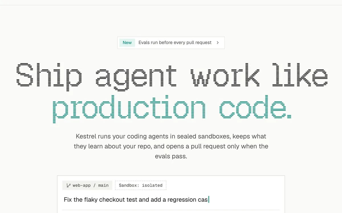
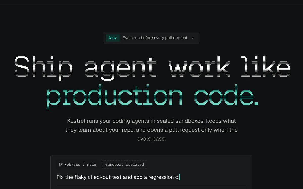 Kestrel
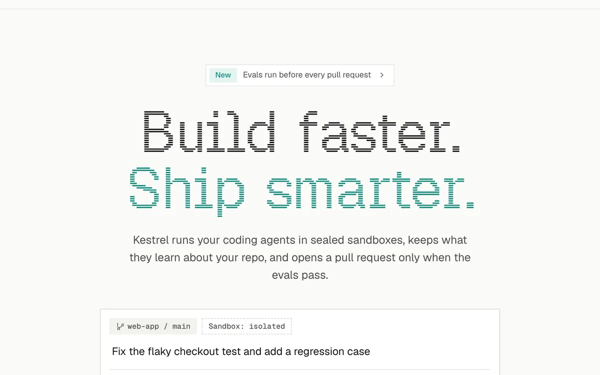
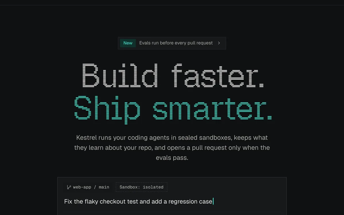 Teaching variant
Check 1: read the two lines
Read the headline and the line under it, and skip everything else. Could you tell a friend what the product does from just those two lines? If you can't, fix the words before you touch colours or spacing.
The headline doesn't have to explain everything on its own. The two lines together should.
Check 2: see where your eye goes
Kestrel's hero has a small pill above the headline, the headline itself, the paragraph and a product preview. If all of them get the same weight, nothing leads, and you end up reading in a random order. I want the headline first, then the line under it, then the preview that shows the product working.
A quick way to test it: blur a screenshot and see what still stands out. Do it at desktop width and on your phone, because the order can change once things stack.
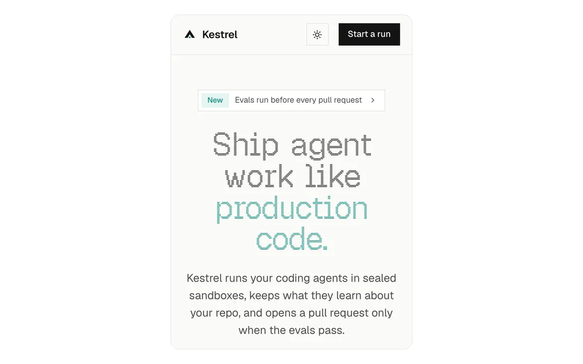
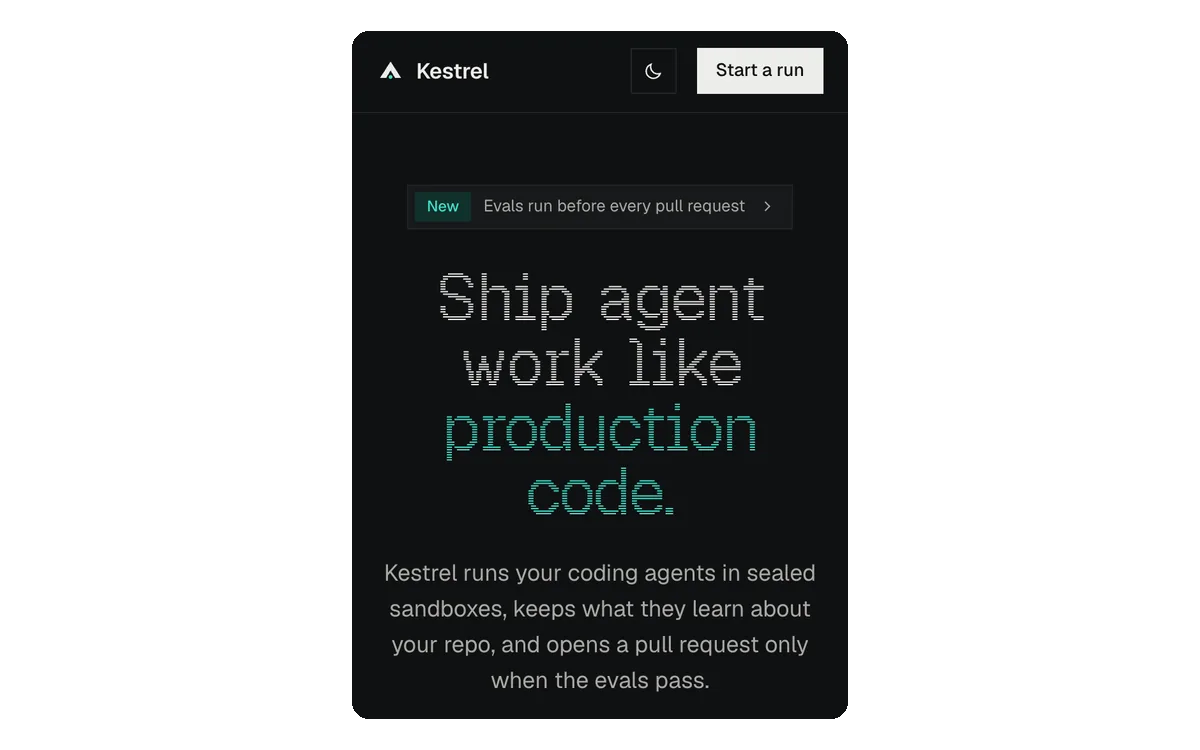 Kestrel at phone width
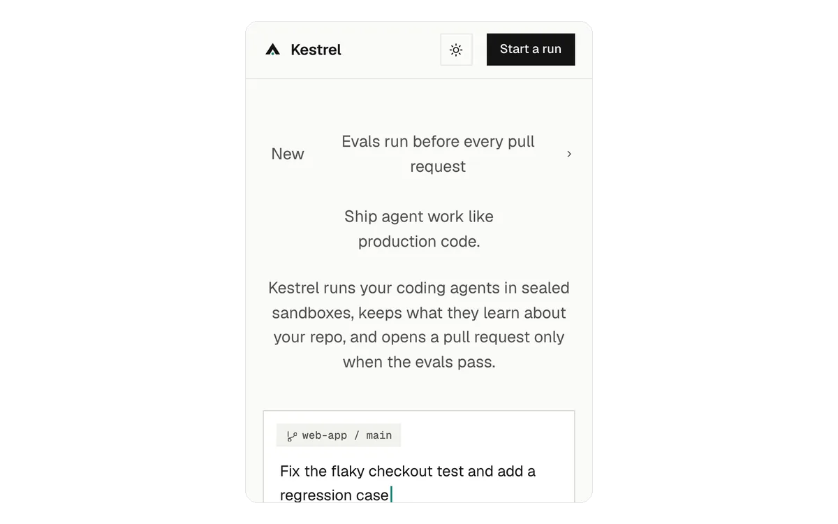
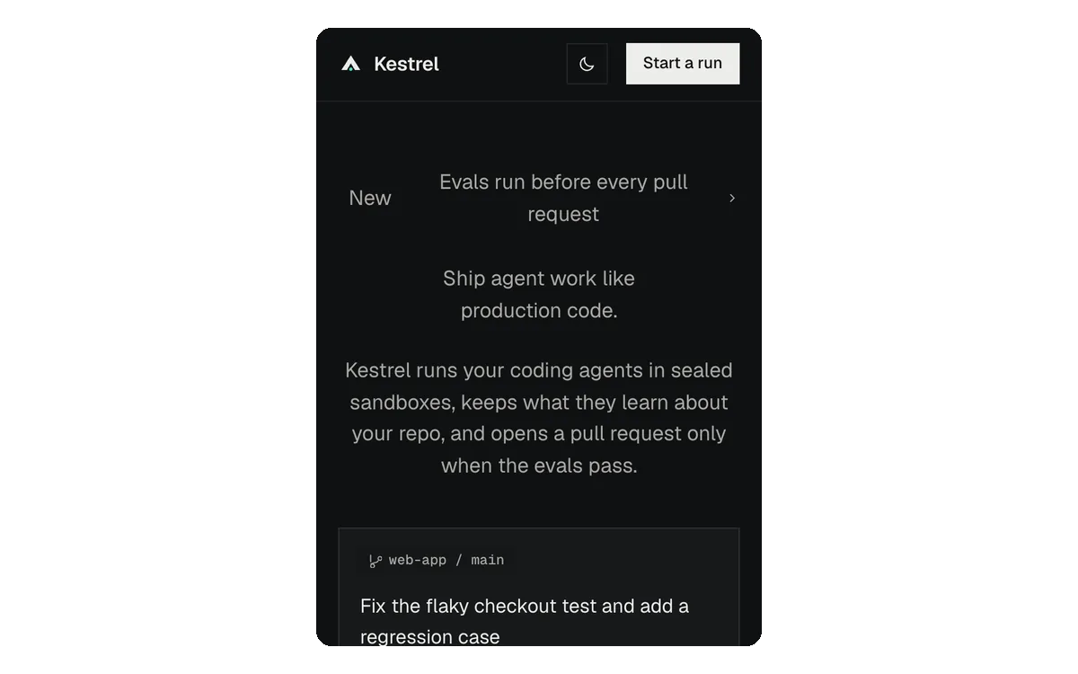 Teaching variant
Check 3: read the button
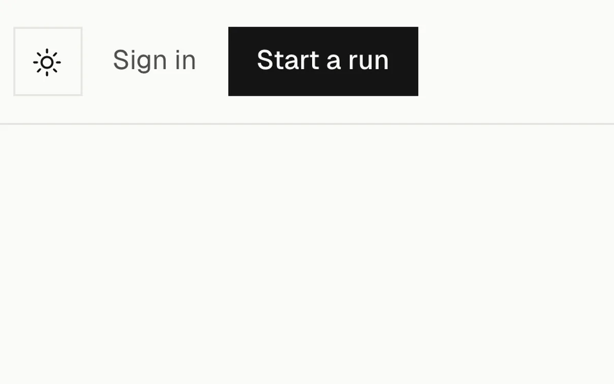
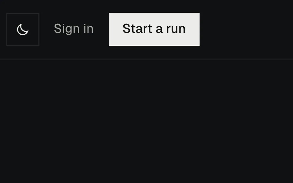
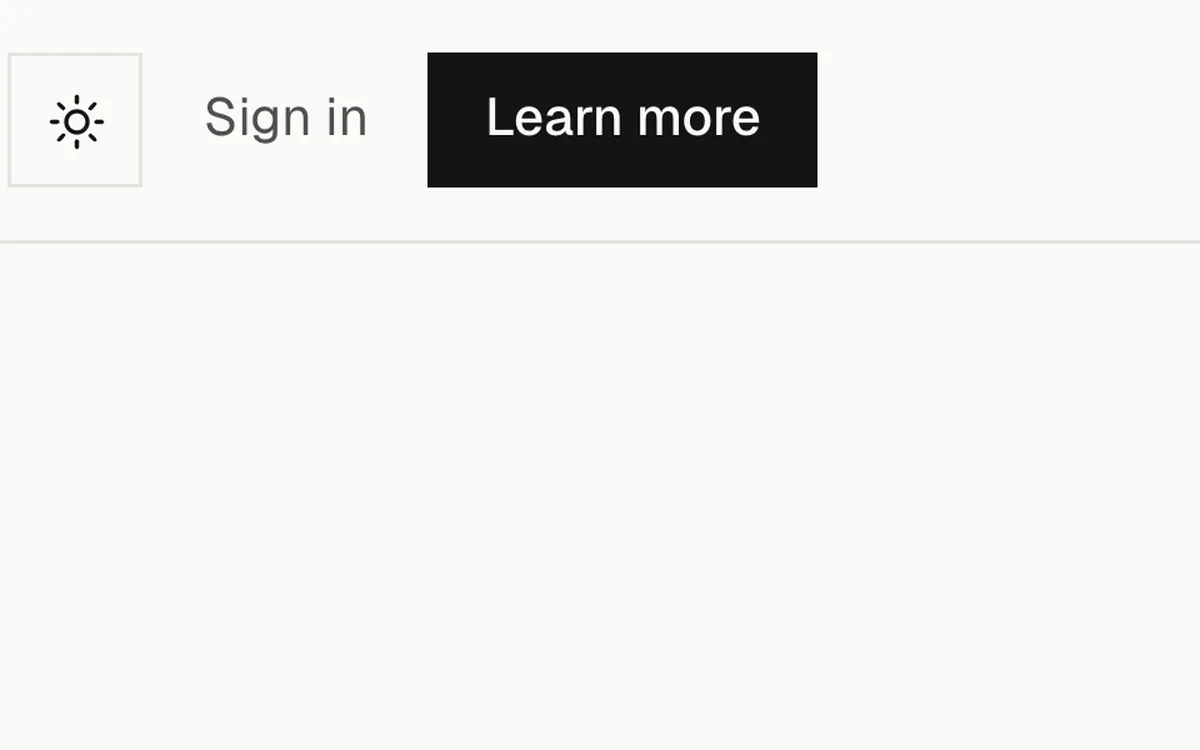
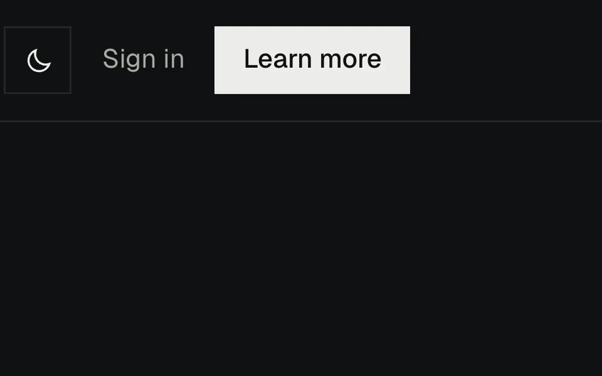
Kestrel's button says "Start a run", and it takes you to a section called "Your first run in two commands". Change the label to "Learn more" and it still goes to the same place, but the words don't tell you that anymore. Learn more about what?
A button should say what happens when you press it. On a phone this matters even more, because there's less around the button to explain it.
 Kestrel
 Teaching variant
Ask your agent for a second read
You can hand this review to your agent too. Give it a desktop screenshot and a phone screenshot, and ask three questions:
- What does this product do, in one sentence, using only what's on screen?
- What do you notice first?
- What would you click next, and where do you expect it to take you?
Compare its answers with what you meant. If something's off, go back to that part of the page. The agent can miss things or give you a bad read, so don't treat its answers as proof.
None of this needed a new colour or a new font. Most of it was reading the hero the way someone new would, and fixing the words and the order before anything else. A short version of these checks is in why vibe-coded websites look the same.
Illustrations that explain one idea
I make Illos: 186 animated illustrations that each explain one idea on a product site, such as a queue, a deploy or a payment, in five themes. The 79 spot illustrations are free, with no account.
Browse free illustrationsQuestions
Anything else? Write to hello@illos.dev.
How do I know if my hero headline is clear?
Read only the headline and the line under it. If you can't tell a friend what the product does from those two lines, rewrite them before you change colours or spacing.
Does the headline have to explain everything?
No. The headline and the line under it share the work. Together they should make the product clear.
What should a hero button say?
What happens when you press it, such as "Start a run". "Learn more" can go to the same place, but the words no longer tell you where.
Can my coding agent review the hero?
It can give you a second read from a desktop and a phone screenshot. It can miss things, so compare its answers with what you meant rather than treating them as proof.